Project
JH&AA Management
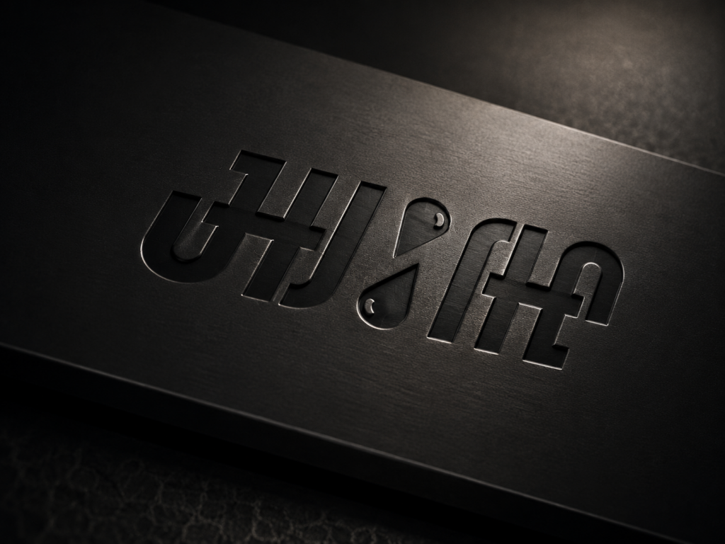
JH&AA trades gas out of Angola. The mark had to work on a shipping document, on the side of a truck, and at the size of a phone contact photo, in a market where a great deal of business is settled in WhatsApp threads.
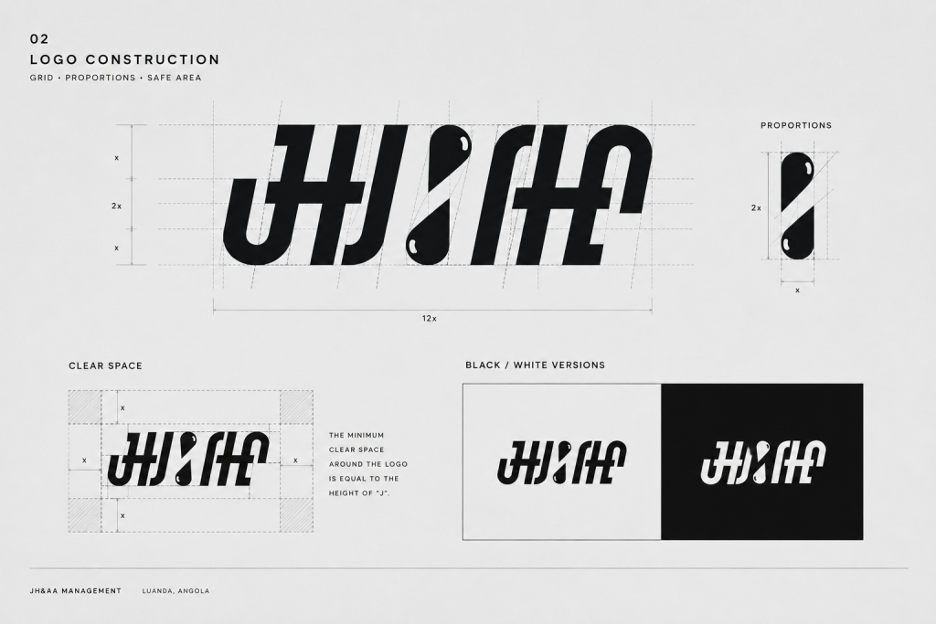
The idea sits in the middle of the name. The ampersand is drawn as a drop: the thing being traded, placed exactly where the two names join. Everything around it is custom lettering rather than a typeface — one slanted geometric alphabet, cut so the J, the H and both A’s share the same stems and the same angle. The slant does the rest of the work. It reads as flow, as movement, as something on its way somewhere.
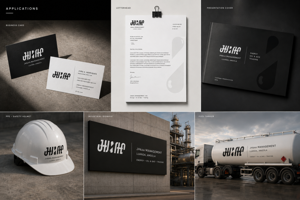
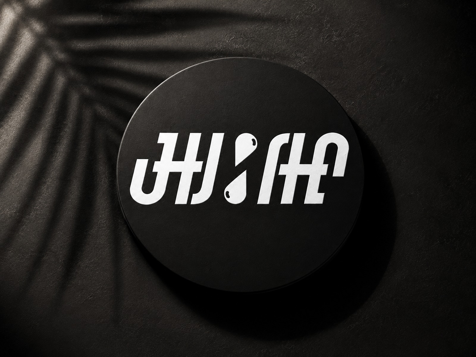
Two lockups came out of it. The horizontal wordmark carries documents, letterheads and signage. A circular badge, white knocked out of black, covers everywhere the mark has to survive at forty-eight pixels — messaging profiles, social accounts, a stamp on a bill of lading.
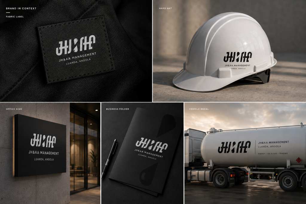
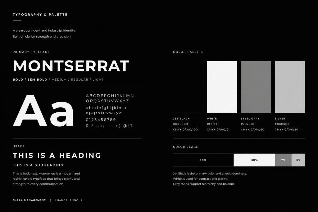
The logotype is custom; everything around it is Montserrat, and the palette is four steps of grey with jet black doing sixty per cent of the work. That is deliberate. Trading paperwork gets photocopied, scanned and printed on whatever machine is in the office that day, and a system with no gradients and no hairlines comes through all of it intact, on a letterhead, on a hard hat, and on the side of a tanker.